How AgriForce looks and sounds
For anyone making the app, slides, brochures, stickers, ads or the website. The tokens here are the ones the live product uses, so what you design matches what customers see.
The AI growth operating system for agriculture
One live system from the ad a farmer sees to the seed leaving the plant.
- Management of seed and agri-input companies want proof it works on top of SAP and Salesforce and does not add work.
- Field teams in villages, plants and warehouses want big buttons, their own language and nothing to learn.
- Farmers and dealers, reached through QR codes, WhatsApp and calls, want to be understood and helped fast.
Personality: plain, confident, concrete. Built by people who have run agri campaigns, not a software vendor talking in abstractions.
A seedling on a green tile
The wordmark sets AGRI in ink, FORCE in the second green, and OS small in ink-2. Never redraw it, recolour it or stretch it. Download the files below.




Keep clear space equal to the height of the tile’s seedling (x) on every side. Minimum size: wordmark 120px wide on screen, 30mm in print; mark alone 24px. On co-branded material the client’s logo sits beside ours, separated by a thin rule or an “x”, never inside our tile.
Use the reversed wordmark on deep green or on a photo with a dark scrim.
Change the green, add effects, outline it, or set it on a busy photo without a scrim.
Write “AgriForce OS” in copy. “AgriForce” alone is fine after first mention. Never “Agri Force” or “AFOS”.
Two greens and warm neutrals
The brand green is for anything you press and for the active state. Everything else is warm neutral: straw off-white, green-black ink, and a deep forest instead of black.
Brand
Primary green: buttons, eyebrows, active nav, the FORCE in the wordmark. Text on it is on-brand.
Contrast with ink 2.1:1 · with off-white 7.6:1Lighter green for hover, wordmark accent, bar fills. Not for body text on light.
Contrast with ink 4.0:1 · with off-white 4.1:1Eyebrows, numbers and highlights on bg-deep. 4.5:1 on bg-deep.
Contrast with ink 10.7:1 · with off-white 1.5:1Icon tiles, selected rows, soft badges.
Contrast with ink 14.7:1 · with off-white 1.1:1Dark hero bands, cover slides, phone frames, dispatch sticker frames.
Contrast with ink 1.1:1 · with off-white 15.6:1Neutrals
Page background behind glass panes. Warm off-white, never pure white.
Contrast with ink 15.2:1 · with off-white 1.1:1Cards on a light page, slide cards, brochure cards.
Contrast with ink 16.4:1 · with off-white 1.0:1Alternate section background on slides and web pages.
Contrast with ink 14.8:1 · with off-white 1.1:1Card borders and dividers. In the app: rgba ink at 9% and 17%.
Contrast with ink 12.6:1 · with off-white 1.3:1Headings and body text on bg, surface-2, surface-3.
Contrast with ink 1.0:1 · with off-white 16.4:1Secondary text, captions, statement lines under headings.
Contrast with ink 2.2:1 · with off-white 7.5:1Labels, footers, placeholder text. Minimum size 12px.
Contrast with ink 4.3:1 · with off-white 3.8:1Body text on bg-deep.
Contrast with ink 12.0:1 · with off-white 1.4:1Status and data
Always paired with a word (“Delayed 3 h”, “Credit blocked”). Regions keep the same colour on every map and bar: South good, West info, North amber, Central and East violet.
On time, delivered, approved, genuine. Always with the word beside it.
Contrast with ink 3.4:1 · with off-white 4.8:1Near limit, delayed, busy.
Contrast with ink 3.6:1 · with off-white 4.6:1Overdue, credit blocked, past SLA, alert zones.
Contrast with ink 3.1:1 · with off-white 5.3:1Distributors on maps, loading, Salesforce and Meta references.
Contrast with ink 3.0:1 · with off-white 5.5:1Events and chaupals, the Central and East region, SMS.
Contrast with ink 2.7:1 · with off-white 6.2:1Voice AI and WhatsApp activity.
Contrast with ink 3.4:1 · with off-white 4.8:1The North region, cash out, packaging.
Contrast with ink 5.1:1 · with off-white 3.2:1Outfit for headlines, Manrope for everything else
Both from Google Fonts. Outfit always at 800 or 900 with tight tracking. Manrope 500 for body, 700 for emphasis. Minimum 12px for anything a person reads in the app; 24px on slides.
Real fields, real people, real screens
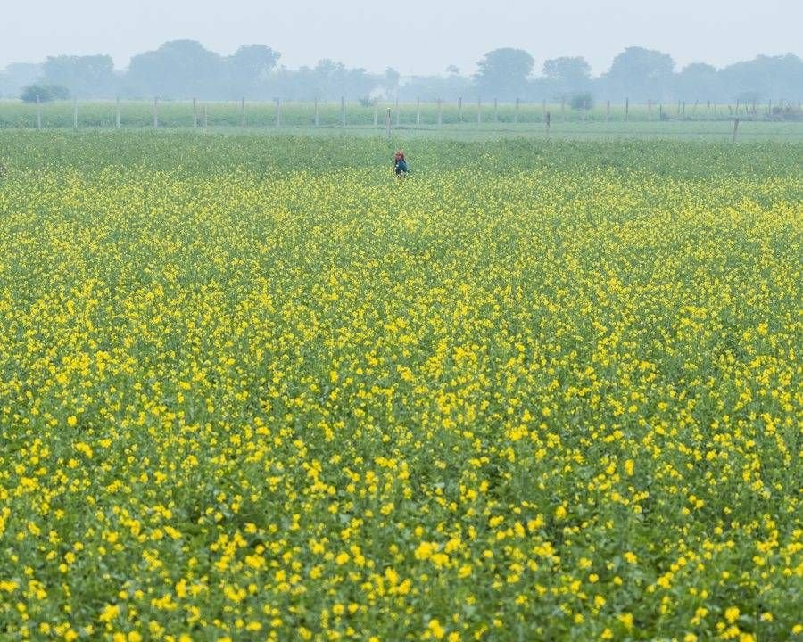
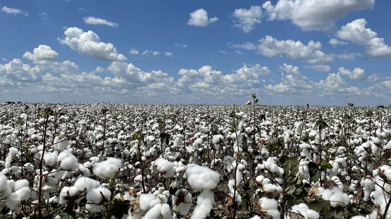
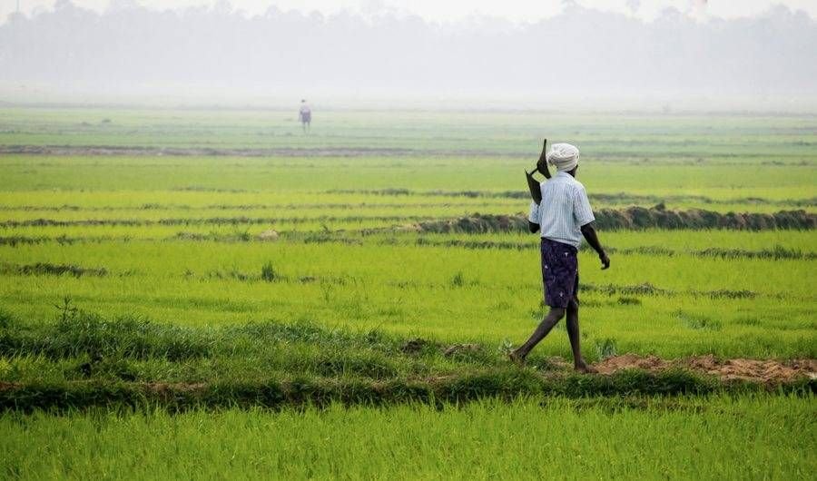
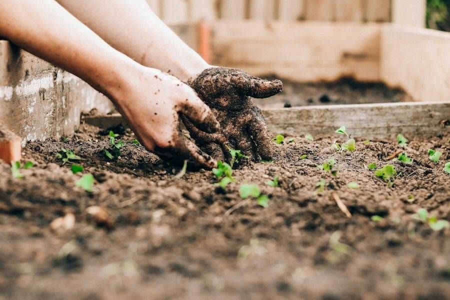
Field photography of cotton, mustard, paddy, dealers, farmers and plant floors. When text sits on a photo, add the deep-green scrim at 80 to 95 percent from the text side.
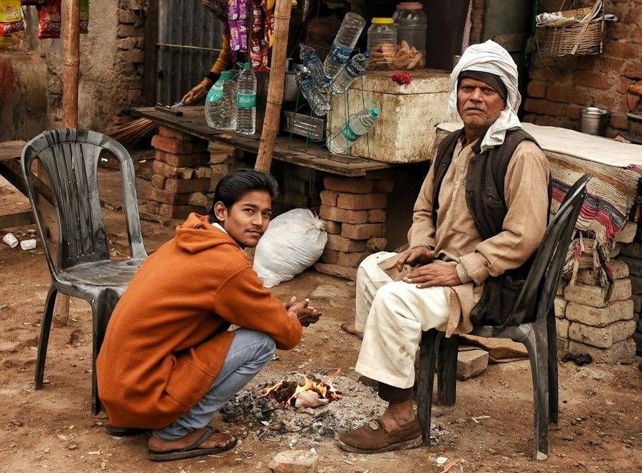
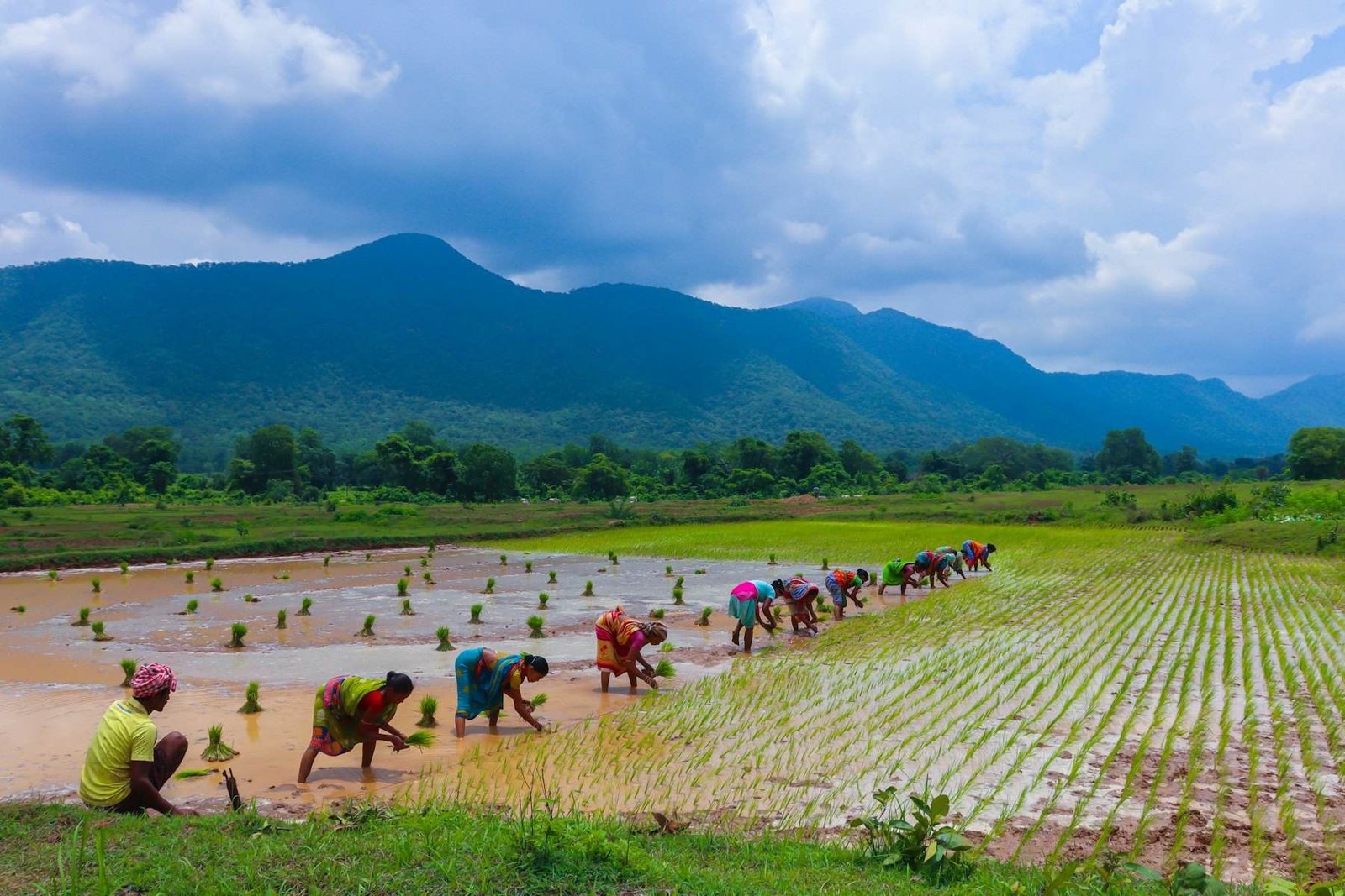
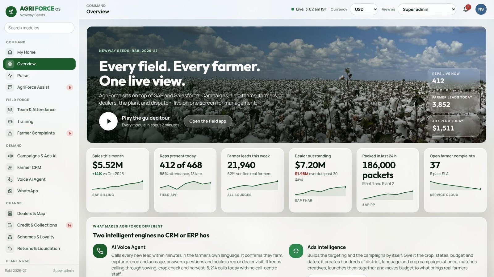
Product screens sit in a deep-green frame (8 to 12px padding, 22 to 24px corner radius, the frame shadow). Phones keep their true 9 by 19.5 ratio and are scaled, never squashed. Never mock up fake UI; capture the live demo.
Glass in the app, solid cards everywhere else
Panes are glass: white at 64% over the field photo with a 22px blur and a 1px highlight. Corners 6px so it reads as custom software. Every screen opens with a photo banner.
Solid cards on #FBF9F3 with a #E2DCCB line and 22 to 24px radius. Alternate section backgrounds #F3F0E8 and #F1EDE2, one deep-green statement band per section.
Six big buttons, 48px minimum targets, one job per tap, local language first, offline bar in amber when disconnected.
Spacing scale
4px
8px
12px
16px
20px
24px
40px
64px
128px
Corner radius
4px
6px
12px
24px
999px
The building blocks
Buttons
One primary per view. Pill on web and slides, 6px radius in the app.
Status tags
Tinted background, full-colour text, always a word.
KPI tile
Label, number in Outfit, change, and the source of the number.
Plain, confident, concrete
Describe what the system does in the words a sales head or a plant manager would use, and show the screen rather than describe it.
| Principle | Write | Avoid |
|---|---|---|
| Say what happens | “Calls every lead within minutes” | “AI-powered engagement” |
| Name the source | “Sales this month, from SAP billing” | A number with no source |
| Never oversell | “Reported by AgriForce customers” | “Guaranteed 3x growth” |
| Short and plain | One idea per sentence. A full stop, not a dash. | Long sentences joined with em dashes |
| Farmer’s language first | Hindi or Telugu copy written for the farmer | English idioms translated word for word |
| Market number formats | ₹4.2 Cr in India; $5.5M, €2.1M elsewhere | Lakh and crore on a UK screen |
The AI growth operating system for agriculture.
One live system from the ad a farmer sees to the seed leaving the plant.
Curly apostrophes and quotes. No em dashes in product copy; use a full stop or a comma.
Quick checks before anything goes out
Questions about the brand: sales@newwayservices.in · Newway Agri